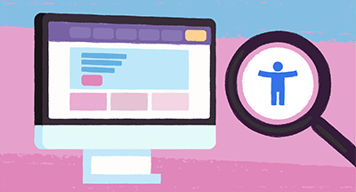
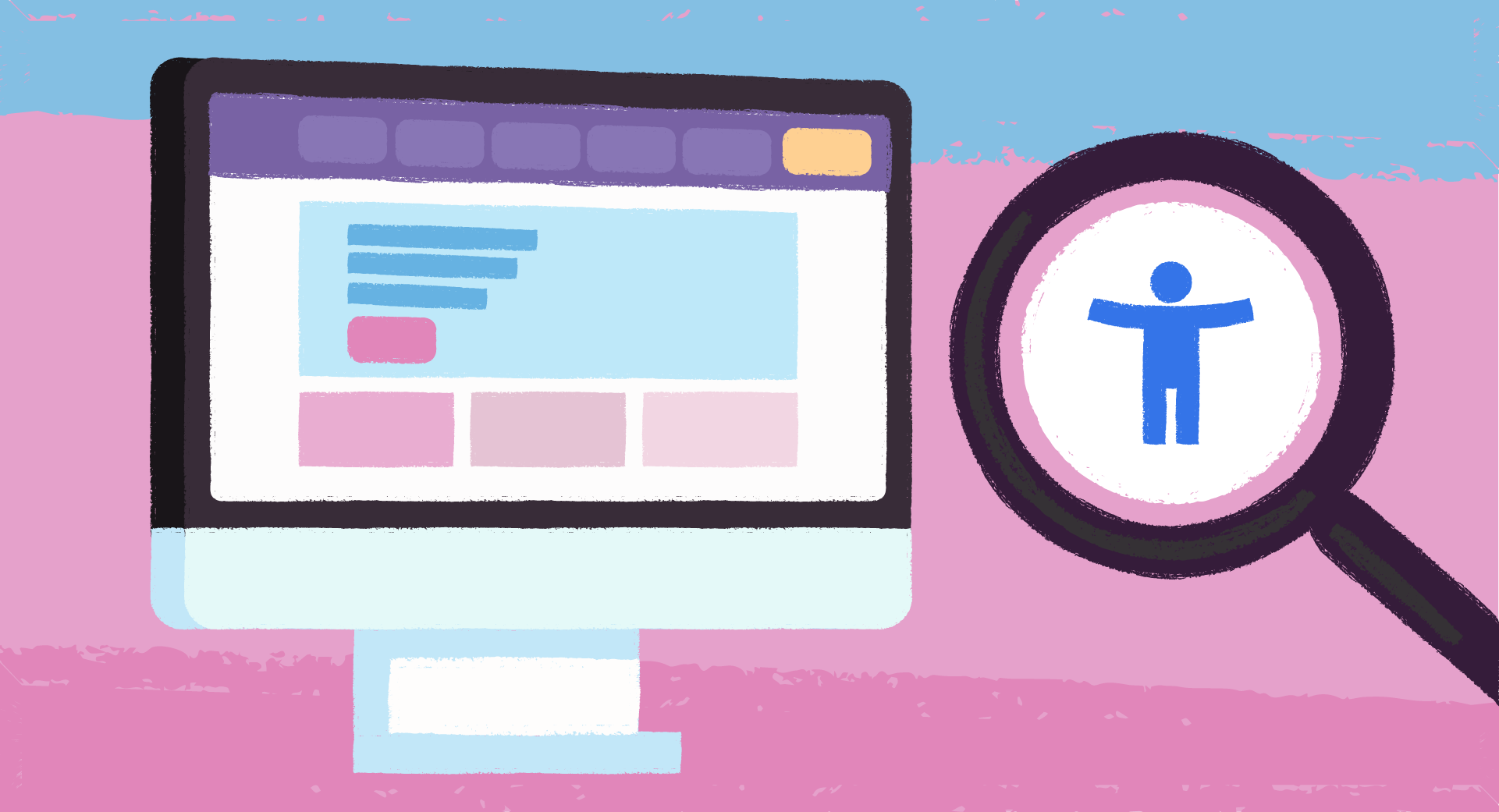
As educators, it’s a point of pride and duty to serve every student where they are today and help them grow a little more. In the world of technology, that concept is encompassed in universal design—accessibility.
Universal design takes accessibility to the next level. Rather than designing for the diagnosis, universal design makes it easy to use software for anyone regardless of their needs or limitations. It’s edtech for everyone, not edtech with features bolted on to make it accessible.
Here are a few clues that your edtech provider is in tune with universal design. Now, not every screen will feature every one of these clues, and we do mean clues—not a paperclip concierge walking you through the user experience tour on each screen. Instead, think of this as a scavenger hunt rather than a blackout bingo card. The more you can find, the better the odds are this solution will be accessible for all.
Text designed for all users
1. Larger font size, nicely spaced, helps people skim
That’s how we all tend to read things online.2. Text broken into chunks instead of bulky paragraphs
It gives your eye a place to rest and helps users with dyslexia.3. Text starts at the top and moves left to right
(Or aligns with your native language.) No offbeat design choice is worth the effort the user must take to stop and understand a different pattern of reading.4. ONE font without a lot of flourishes
It’s super tempting to bust out all your favorite fonts, but again, communication takes precedence over quirky design.5. Text effects (underline, bold, italic) kept to a minimum
Overuse can confuse readers and screenreaders (programs that help visually impaired users) alike.6. Detailed calls to action on links and buttons
Try “Submit a request” or “Read the newsletter” instead of a generic “Click here.”
Layouts designed for all users
7. Multimedia communication in multiple places with multiple techniques
Example 1: If an error occurs, the user should see both a red notification AND text to explain what happened and how to fix it. This solves for users who may not see colors the way the designer does.Example 2: Post a video and include closed captions or post the transcript as well.
8. Flash and other moving graphics used safety
No more than three frames per second.9. Large buttons well-spaced
No need to require expert dexterity to fill out a simple form, particularly on a small device like a cell phone. Instead, give the user lots of space for check boxes and other buttons.10. Simple layouts
Negative space is everyone’s friend. Above the fold is nonsense in the age of infinite scroll, so don’t feel like everything has to be accomplished in a single, very busy screen.
Navigation designed for all users
11. Keyboard-only use
Especially helpful for forms.12. Mobile-friendly design
Many households depend on a mobile internet connection or don’t own a laptop or desktop computer. Also, mobile-friendly design is often more aligned to universal use standards anyway, with easy-to-read text and plenty of spacing.13. Printable options
Another way to accommodate users who may not have access to reliable internet at home.14. Generous time limits
For users with lower literacy, higher anxiety, and the simple need to re-read and perfect responses, allow as much time as possible before a session times out.
Processes designed for all users
15. Time to review responses
Before submitting a form or survey, give users a chance to re-read and edit responses.16. Let the user know what will happen next
Even better, provide the information before the user submits the form.17. Lots of help options
Make it easy to request assistance or find solutions.18. Multiple response options
Support different channels for users to reach out, rather than limiting contact to telephone only, email only, or live chat only. More options for communication are helpful for different users.
Testing designed for all users
19. Aware of bias
Bias isn’t a dirty word. We all have biases, including subconscious bias. What matters is that it’s acknowledged and accounted for in user testing.20. Diverse and inclusive review team
It’s so important to have a wide variety of people from different backgrounds review solutions. In fact, a larger review group means you have a chance of better serving a larger group of users. Since just about everyone goes to school, it’s of utmost importance that a wide variety of users are represented in the initial user review.Rather than using technical specs and sales pitches on their own, consider adding these characteristics of good universal design to your edtech rubrics.
Follow-up resource: Accessibility from home
When students access edtech from home, how can school leaders ensure accessibility? Read about it in Making Blended Learning Accessible.WHAT'S NEXT FOR YOUR EDTECH? The right combo of tools & support retains staff and serves students better. We'd love to help. Visit skyward.com/get-started to learn more.

|
Nou Chee Her Edtech Thought Leader |